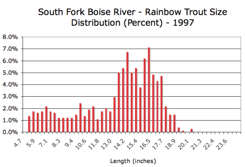
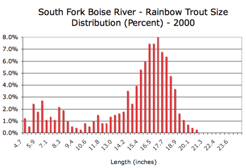
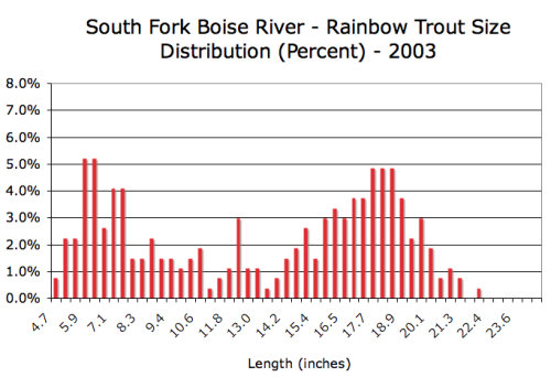
Thanks to Art Butts at Idaho Fish and Game we have the data of the rainbow trout fishery from the last five population sampling efforts, conducted every three years since 1997. We display each sampling effort in a separate chart and it automatically cycles through the slide show.
Each chart displays the percent distribution of trout by size for each year of sample. The information is useful to visualize shifts in population characteristics.
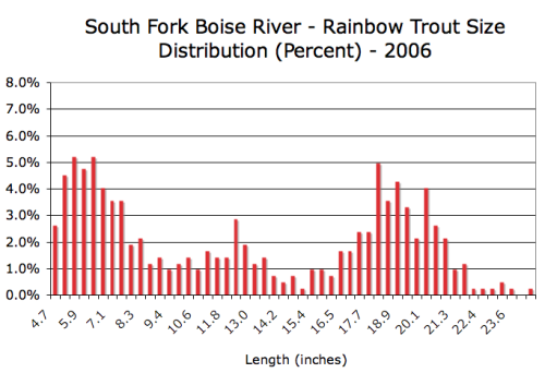
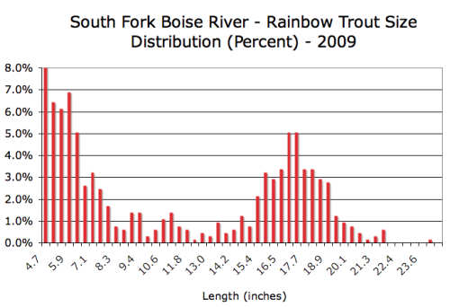
Anglers have been concerned that there are too few young of year trout to support the blue ribbon fishery unless it is supplemented by the population in the SFB canyon and from tributaries near and far. The genetics study showed such contributions from neighboring tributaries does occur. In the 2009 sample the biologists found the largest proportion of small fish in the past thirteen years. One other change noted was the cycling out of the older, very large fish from the 2006 sample. One theory is the very large fish were a product of the unprecedented Mormon cricket invasion starting in 2003 and that all that extra feed made the fish grow large. Whatever the cause, most of them are gone.


